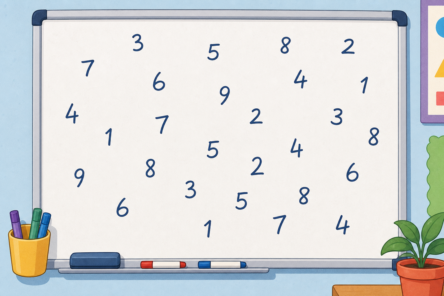
Here is a messy list of reaction-time scores, just numbers scattered across the board with no order at all: 7, 5, 8, 6, 7, 9, 6, 8, 7, 5, 9, 6, 7, 8, 6, 7, 5, 8, 7, 9, 6, 7, 8, 6. Take a good look at them.
If you had to tell someone what these scores were like, what would you say? How could we tidy this mess into something we can actually make sense of?
Display the untidy raw list as pupils settle. Take two or three hands-up suggestions, not open call-out. Listen for ideas like 'put them in order' or 'count how many of each' — both are roads into a frequency table.

Watch how we tally the messy scores from a moment ago into a frequency table. Each column header is one of the actual score values, and every time that score appears we add one stroke. Every fifth stroke crosses the previous four so we can read the totals at a glance.
When the values spread out too far to list one at a time, we group them into equal bands instead. Notice how each band is the same width (ten years each) and every age has exactly one home. If the bands were too narrow we would end up with dozens of them; too wide and everything would land in one band. We want a number of bands that is useful to read.
Look carefully at these bands: 0–10 and 10–20. The number 10 belongs to both bands, so it has two homes at once. That is the trap. Bands must leave no gaps and never share a number, which is why we write 0–9 and 10–19 instead, so each value fits in exactly one group.
Walk each example aloud, one at a time.
Today we explore: here is a fresh set of class data — 18 scores to tally into three equal bands: 4, 11, 20, 7, 15, 22, 9, 13, 25, 6, 18, 21, 8, 14, 27, 12, 19, 24. We will agree on the band edges first, then tally each value into its band and check the totals add back to 18.
Remember the non-overlapping rule: each value has exactly one home. So does 20 go in 10–19 or 20–29? It goes in 20–29, because 10–19 stops at 19.
This round is for talking it through together — pupils take turns at the board and the class agrees or corrects out loud.
Agree the three band edges (0–9, 10–19, 20–29) before any tallying starts — pupils often jump straight to marking and then find a value with no home. Watch for the boundary value (the on-screen reminder names 20 going in 20–29) and revoice: 'each value has exactly one home.' Have a few pupils add tally marks in turn while the class checks the running total reaches 18.
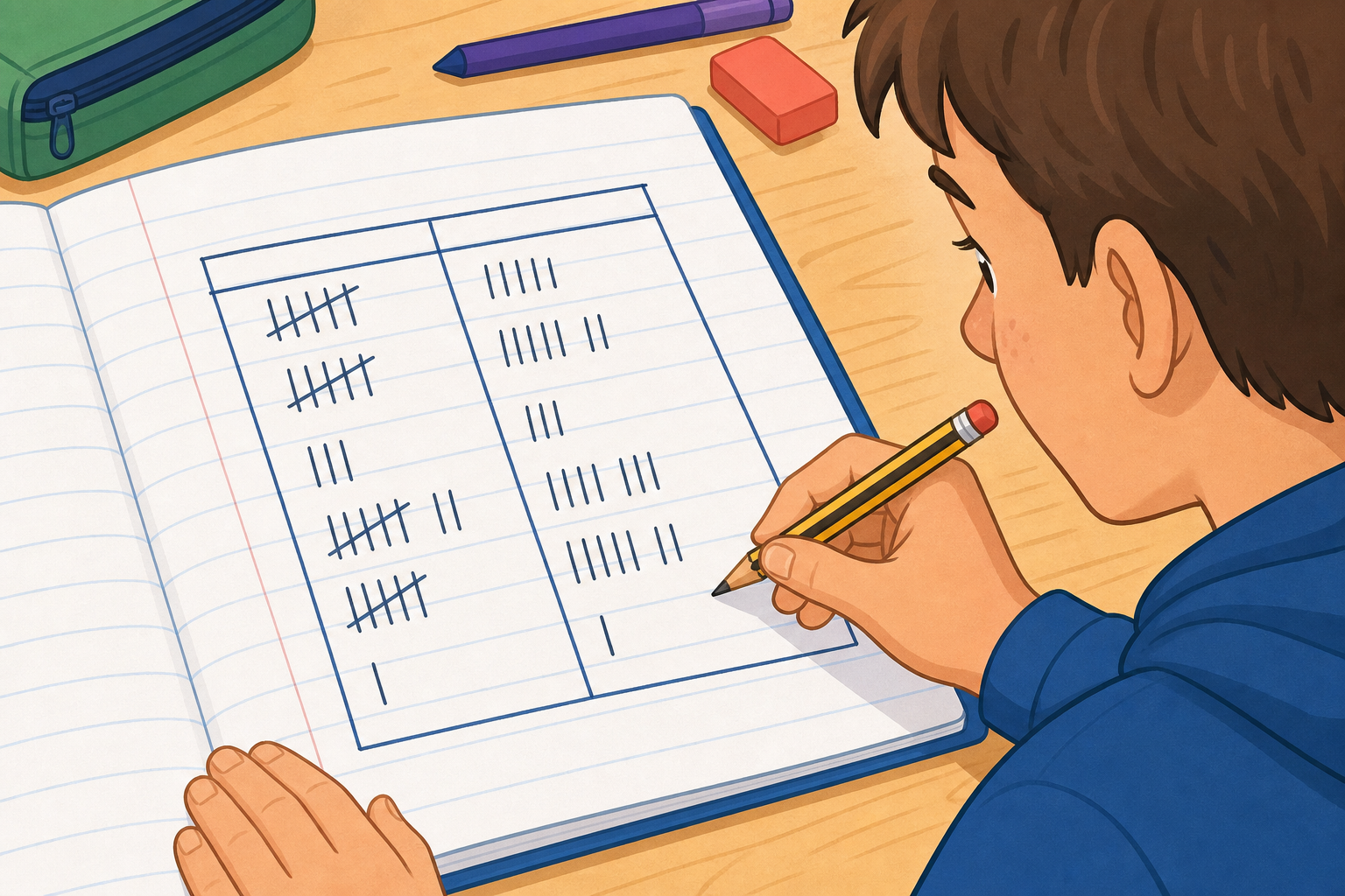
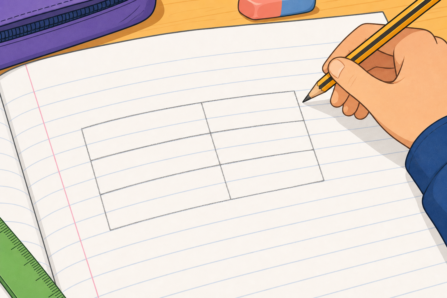
In your maths copy, draw a grouped frequency table with three equal class intervals for the data we have been working with. Give it a tally column and a frequency column.
Fill in the tallies and the frequency for each band, then write the total at the bottom to check it matches the whole set.
Walk the room glancing for equal band widths and tally marks grouped in fives — this is whole-class copybook practice, not marking. A quick check that the bottom total matches the data set catches most slips.
Today we work through three different data sets, and we have to choose the right band width for each one. Here are the sets on the board:
If we choose bands that are too narrow we end up with dozens of nearly empty bands; too wide and everything lands in one. Aim for a band width that gives roughly four to six bands — enough to see the shape of the data without drowning in columns. We will decide the right interval for each set together.
This round is the practice bank — pupils take turns at the board, check each answer, and the class confirms before moving on. Keep the board work brisk rather than over-explaining.
The deciding skill this year is choosing a sensible band width for the spread of the data — too narrow and there are dozens of bands, too wide and everything lands in one. The too-narrow / too-wide tension is now on the pupils' screen, so let them reason from it. Ask each time: 'how many bands does this give us, and is that a useful number?' Aim for roughly four to six bands. Fast finishers wait quietly and predict the band edges for the next set in their head.
What do we lose when we group data into bands, and what do we gain? If someone only sees your grouped table, what can they no longer tell about the original scores?
Listen for pupils naming the trade-off: grouping makes a wide spread readable but hides the exact individual values inside each band. Revoice a strong answer: 'so we can see the shape of the data, but not the exact number any one person got.' Head off the idea that grouping is just 'tidying' — it genuinely throws information away in return for clarity.
Next we turn frequency tables into charts, building and reading bar charts and multiple bar charts to compare two groups side by side.
A quick recap of the three key ideas closes the lesson. The bar-chart lesson that follows builds directly on the grouped tables pupils made today.
You're previewing this lesson. Get full access to this lesson and hundreds more — each one ready to teach, with interactive activities, printable resources and pupil progress tracking built in.